ZAHA HADID ON ARCHITECTURE
By Crash redaction
MEETING ZAHA HADID
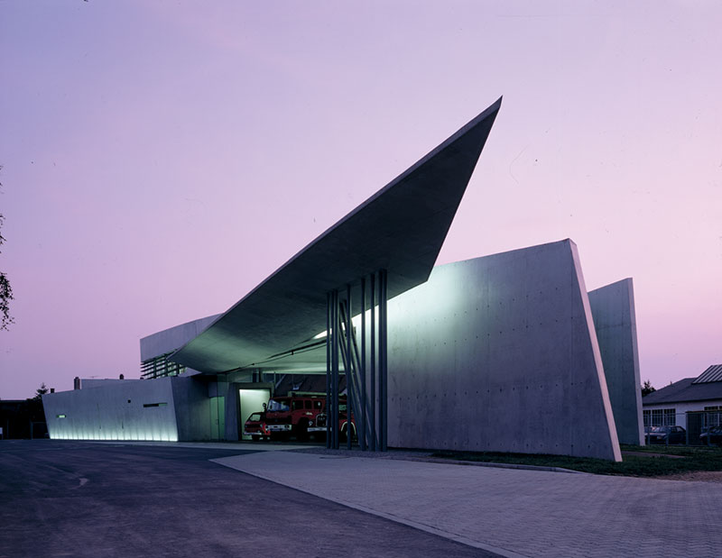
RECENTLY DISAPPEARED, ZAHA HADID IS KNOWN FOR CHALLENGING THE BOUNDARIES OF ARCHITECTURE AND URBAN DESIGN WITH FLUID AND VISIONARY SHAPES. BORN IN BAGDAD IN 1950, SHE WAS BASED IN LONDON SINCE HER STUDIES WITH REM KOOLHAAS AT THE ARCHITECTURAL ASSOCIATION. IN 2004 SHE WON THE PRITZKER ARCHITECTURE PRIZE, THE MOST PRESTIGIOUS ONE IN THE ARCHITECTURAL FIELD. HER BUILDINGS INCLUDE THE VITRA FIRE STATION AND BMW CENTRAL BUILDING.
How have you always managed to move effortlessly between art, architecture and design?
I think the most liberating moment in my career was when I was in fourth year and I realized that if you had a concept then this could apply to many things and that it’s just the technique of use that’s different in each case. And that was exciting for me and it actually liberates you to design whatever you want.
I read that you regarded art and architecture as a totality.
Not really. I think there’s a connection between all these things but architecture’s a lot more complex because you have to deal with space and that’s what’s very exciting about it. People can also achieve it through landscape or installation, but you have to deal with so many aspects in architecture that it makes it much more complex.
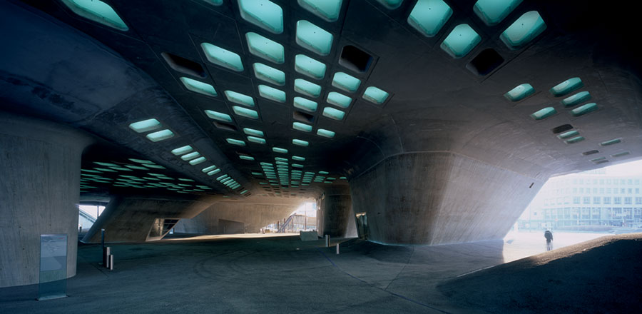
This year you were short-listed for the RIBA Stirling Prize in Britain for the Phaeno Science Centre in Wolfs burg, Germany. What inspired your idea of having this powerful structure sit on concrete cones, with a public open space beneath?
I had already done many studies about how buildings should land on the ground. And we moved away from the idea for the pilotti stilts to the idea of a structure which is like a landscape. So this is a combination of programme and structure together. It was about dealing with the idea of the ground, looking at typography and landscape, and combining two ground images: the landscape and the cones. The cones support the platform and some of them support the roof. The idea was not to copy landscape literally but through complexity you can create a special experience that is equally calming or equally thrilling. It’s also connected with the parameters of structure and composition, and height and light.
The building has been compared to an undulating earthwork with a dark grotto underneath, while the interior is a vast open area, free of conventional structural walls. So it’s a very radical way of representing landscape in architecture.
Twenty years ago architecture as landscape was a fresh idea, but it’s not just to do with the idea of landscape but the idea of fragmentation and abstraction. Then moving towards a fluid morphology and complexity and dealing with very large urban mass. The idea of seamless space between the ground and the podium came out of that morphology. It is much more like a landscape inside because the floor is a lot more flattened.
Despite its fluidity, the Phaeno Science Centre has quite a raw quality.
I like architecture to have some raw, vital, earthy quality. You don’t need to make concrete perfectly smooth or paint it or polish it. If you consider changes in the play of light on a building before it’s built, you can vary the colour and feel of concrete by daylight alone.
After the Vitra Fire Station, in Weil-am-Rhein in Germany, your buildings seem to have become more fluid over time.
Before they were fluid in a different kind of way. At the start they were much more broken and fragmented, it was all about juxtapositions and stuff like that. I think the discoveries for Vitra were that they moved away from the idea of the plane to the volume and also using transparency for materials. It’s about spaces intersecting and overlapping, and seeing through one place to another. I think that eventually they all melted together into one thing.
Your first project in the UK, the Maggie Centre in Fife – a centre for people who have or have had cancer – has just opened opposite the oncology centre at the Victoria Hospital, Kirkcaldy. What was your aim for this project?
The whole programme of Maggie’s was really to have a tiny retreat between the time the cancer patients do the treatment and they go back home. Because these people have chemotherapy and radiation and they come out of the hospital totally depleted. So it’s just a small place. I think it’s a very nice programme. I’m very pleased by my interpretation and hope Maggie’s center will help the people of Fife build a life beyond cancer. I think that fundamentally architecture is really about wellbeing. Every building you make, people should feel good in it.
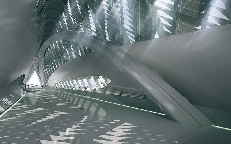
You’ve designed the Rosenthal Center for Contemporary Arts in Cincinnati and the MAXXI, the Museum of Art for the XXI Century, in Rome, which is due to open in 2008. How would you contrast the two?
Well they’re very different. The Rosenthal Center for Contemporary Arts is a vertical museum and has a very soft, gentle, sweeping geometry. The other one is more like a field with lines that intersect.
Your current commissions include museums in Glasgow and Cagliari in Sardinia, and opera houses in Guangzhou and Dubai. Do you feel that your architectural vision is best suited to urban, cultural buildings?
I think museums and concert halls and things like that can be more experimental but you could also do fantastic or luxury housing. But you can’t do that anymore because it’s all to do with quotas and restrictions.
Architecture is known for being very male-dominated. To what extent do you feel that being a woman has made things harder?
I always say the same thing: I don’t know because I’ve never been a man. But it’s been very difficult. Architecture, whether you’re a man or a woman, is very difficult_ Just triple it, or quadruple it for a woman. And also you’re much easier to criticize. They don’t really know how to treat you or behave with you, especially when you’re much younger. Part of the problem is that you don’t have access to all the people who you want to deal with in a normal way. Like a man can go off and meet clients, go sailing or go for dinner. But I can’t complain; I’ve had fun. For me it was quite liberating to be a woman in this profession because I didn’t even know the rules, so I think I had much more freedom in the way I did things. But they have to pigeonhole everything. So if you don’t operate within a certain kind of system they can’t handle you.
But now you’re successful don’t you find that you’re being treated with more respect?
It makes a small difference. They will still patronize you, particularly in Britain. The building industry in Britain is very conservative but I don’t want to generalize. Here in France they treat me like a foreigner. It’s very different when the people that you’re dealing with are part of the civil service or part of the state. They have a different attitude.
On the design front, you’ve designed a very sleek car, called the Z Car – a two-seater city car with a three-wheel base. What inspired it?
I had a Smart car. And the idea was to design a small
car that could also be fun and noticeable. You don’t really need big cars. I have a driver and I must be the only one driving
a Smart car with a driver!
Will it be going into production?
I don’t know actually. They say so but I’m not sure.
The prototype of your Aqua table edited by Established & Sons sold at an auction in New York for $300,000. What are your thoughts on how design has become so collectable?
I think it’s interesting. It’s like photography, you know, people started buying photography because it was cheaper than buying painting or installations and then it became very expensive. Also, when I started doing furniture it wasn’t just so people could sit on it, but so you could have space dividers. It came out in my work that the interior of houses or offices should also be fluid. These objects could also be a way of dividing spaces or making you move yourself in a certain type of way.
Because you designed a curved wall for an office building in Berlin in 1986.
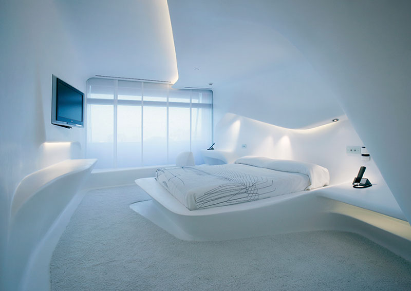
My friends used to say to me, « How can you be sitting against a curved wall? » And I’d say, « Because you can make a curved piece of furniture. » But also what I think is interesting is that when you’re sitting in a rectangular room you’re always looking in a certain way. But the moment you change that geometry, you’re facing many different ways. When you go to a space, you always stand against a wall to look at it; you’re not standing in the middle of the room. But if you have a different geometry it allows you to experience space differently.
Interview conducted by Anna Sansom
‘Zaha Hadid, New Architecture 08/09’ is edited by Alexandra & Andreas Papadakis. ISBN: 1901092526.
Toutes les images – COURTESY ZAHA HADID ARCHITECTS, LONDON


